Wednesday, May 12, 2021

2021 Color of the Year ... which one will you use ?


I must say I wish I have a wall to use this colour on... I love it.


I also love love this poster !  I think it is a must have for the Beatles fan !  You?  are you a Beatles fan ? 


oh my this is so so nice with all the natural fabrics and that lamp wow... 


Ok, this is totally different but again so so nice,  I looked it up in my fan deck and was surprised just how deep a colour it really is... if your a Tiffany blue fan this colour is for you !

Again with natural colours it is a wow...
Great office colour !
Kitchen ... what kitchen would not look wonderful in this colour ?  Just beauiitful with the brass knobs and lighting.
Wonderful colour for a front door... feels like a home at the sea to me...


Ok with one is for you???
Please leave your comment below, thanks so much....


Wednesday, April 7, 2021

Tiny Home... 2 different room layouts !

Tiny Home... you read that right, I worked out 2 totally different layouts with all the same pieces... not easy to do ... most times I cannot do it...  so check it out...

This is the space I was asked to design, as you can see it is small, the space needed  to seat 4 people at-least. 

From the picture you can see the space I had to work with was from the fireplace to the windows keeping enough room in front of the kitchen to work in the kitchen, and that refrigerator door need to open with out any problems.

So... not much room at all.  I am always up for a challenge, working out the puzzle of a floor plan is totally what I live for, no joke... I love working on floor plans!


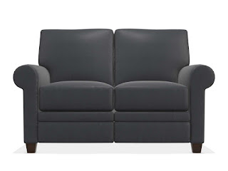
So the client had picked out a loveseat she found comfortable in blue leather... that is all I got.. working with the clients measurements (covid we are not going into homes at the moment) and a few pictures that gave me an idea of the colours of wood in the room I went to work...

 
started with the leather loveseat from La-Z-Boy (Colby from the Duo Collection) you would never know its a total reclining piece... 


picked a fabric for the pillows that repeated the outdoors with the leaves...


picked a very small dining chair from Canadel that also worked for visitors hanging out visiting or dining ! the distressed wood finish I used was close to the stain on the lower walls and the blue fabric worked with the pillow fabric.


again from Canadel I found small enough tables 18" wide ... I needed 2   I picked the same wood finish as the kitchen cupboards knowing I was going to use an area rug on the floor for contrast


cute lamps I used on each table... just the right touch !


used my favorite wood topped benchs from Canadel for little coffee tables ... I used 2

I love these little 18"x18" benchs ... use them all the time for coffee tables in very small rooms. if you are looking for them they are under benchs not stools on their website


this is the small round table with a leaf that I picked from Canadel, pictures above show closed and open, it will work for 2 people using the blue chairs above or for 4 people with the leaf using the 2 chairs and the 2 benchs as seats since they are meant to be sat on. 


heres the look of the table with chairs


then the wonderful rug to put it all together !  


the client and I picked this rug from Loloi, it is a Magnolia Home rug from Joanna Gaines called Lucca it had the navy colour from the leather and the sofa oaky colour of the walls and floors... and its a traditional look that works with the look of his tiny home.


Room Layout # 1 

looking at the kitchen but feels totally open and says welcome come hang out with a cup of tea and talk.


Room Layout # 2 using all the same pieces welcomes you to look out to the view with your feet up reclining with room for visitors to be with you chatting.


Here is the Storyboard to show it all together...


that was my first Tiny Home... hoping its not my last...


Tuesday, April 6, 2021

Room of the Day

A look back at a clients room I did a few years ago


I think it stands the test of time


Neutral colour at the time, the client used her own rug...
 I remember wanting to add a bigger one and a little lighter in hue.
One that all the front legs of the sofa and recliners were on.


Today as then, I would just change out the rug for a larger one with more colour or lighter,
  alot more lamps, new artwork & a few colourful pillows to give the room a new look for 2021.

Thoughts ?

Monday, April 5, 2021

Which room layout would you choose ?


Clients often have lots of ideas for their rooms before I get to their homes, they have studied their room and have a specific floor plan in mine. This client had it all worked out before I got to the house to measure...  One of these 3 layouts is what they asked for....   Thinking I could do better, I did a few other room layouts.  Which layout would you want if this was your room ?    Which one do you think they asked me for ?  Which one will be delivered in the future ? 


No. 1

No. 2
No. 3


Shows a sofa but its only for the look, the website these furniture pieces are from would not do a sectional of the same piece. La-Z-Boy Furniture.   The rug is a 9'-9" square from Surya .  Tables are fab from Hammary.  Cute chairs and pillows again from La-Z-Boy Furniture. Wonderful lamp from Uttermost.


List your guess in the comments... looking forward to your answers !  Hope someone is following my blog... I do it for fun but it would be nice if someone was watching ... lol 


Where do you put the Television?

Want a nice living room, smart looking, great for visiting guests
 
(when we can have guests again) 

BUT

 you still want to watch television... check out this floor plan... I have it all worked it out !


Put the TV over the buffet in the dining area on a arm bracket !


You get the living room you want for visitors & the TV room you want for every day TV...

even better if you get the new television from Samsung

that changes into a piece of art when it's back against the wall and turned off...

check out how good a television can look below.


no one will know it's a TV until you turn it on


it just looks like art on the wall


even you will forget its a television.


Thursday, April 1, 2021

Black Accent Walls... Yes or No???


Thought this morning it would be fun to ask a question of everyone out in the blog world... 

Black Accent Walls, yes or no ???


Dining room with candles


Fireplace wall... lots of drama 


Loving black in an office closet, you??


A headboard wall, this looks amazing with white bedding!


This might be my favorite... love the wood slats adding before painting


Ok, you have your say in the comments... I love black ... live in black clothing most of the time and have alot of black in my condo... you ?  do you do or use black??? yes or no and why...

Friday, July 14, 2017

Best Mantel Colour for Red Brick...


This was my clients fireplace the day I measured for her new furniture… nice, pleasant to look at… the art is nice over the mantel… but the fireplaces overall look could be better…


Bless my clients heart, she did not mind me suggesting a new colour for the mantel… as I always do,  I mention to cover it in black paper or black painted cardboard… she used black garbage bags to see what it would look like painted black, whatever works I say…

She said she thought, yes that does look better... time to paint...
Benjamin Moore Onyx 2133-10  its just the nicest black for mantels, doors, windows …
Well this is it… the mantel painted... it looks amazing !


My client loves it, the black just balanced the top with the dark grey black tiles... look how much better the art looks !
Amazing what a quart of Benjamin Moore Onyx 2133-10 can do!


Friday, February 17, 2017

How to Purchase the Right Scaled Art...


Have you ever wondered how an interior designer shops for art ?

She or he works out the floor plan first, knows where the art is going and over what ?
 (sofa, console, dining wall, fireplace mantel)
with this measurement they look for a piece that will go, not the right size they move on,
looking for the right size and look,
but most important the right size...


We shop with the measurements all worked out, when your shopping and see an amazing piece.. your heart skips a beat ... stop and get out your measurements, is it the size you are looking for ?  
Is it in the right measurement range?

 Yes, you are having a good day...

 No, not in the width range...

put it down walk away, do not think about it...just walk away....
it will never make you happy over your sofa !!!

so this is the RECIPE

width or height (of item) divided by 5 = answer
answer  x 3 = width or height  your looking for

So the sofa width is 80"
80 divided by 5 = 16
16 x 3 = 48
your measurement you are looking for is 48" to 50"


this art is very nice... but to small, the sofa wall will never look just right
now it works for the height of the artwork too
Height of the wall, 96" (most homes, but make sure to measure just in case its taller)
Height of the sofa, Laurel in the picture 39" tall
96 - 39 = 57
this leaves 57" above the sofa for the height of the art
57 divided by 5 = 11.4"
11.4 x 3 =34.2
Now the height of the artwork needs to be 34 to 36" high


its an easy calculation to work out the art size

out shopping for this room above

48 to 50" wide X 34 to 36" high

and it is placed 5" above the back of the sofa, centered over the sofa

and your done...


ps, foot note to this rule... if you are looking for more than one piece of art... have all your measurements worked out so if the heart stopping piece you find doesn't work over the sofa, it just might be just the thing for another wall... if you have your list of sizes worked out you will be bringing home the one you fell in love with, a totally lucky day !

Have fun shopping with your measurements in your pocket or purse... working it out in advance will make your day if you find the perfect piece, I promise !!!


Sunday, October 23, 2016

Sunday Share....


Amazing place to cook, open for guests to watch and talk to the cook.
Looking to the back of the condo, the living room looks like an wonderful space to hang out with a coffee & read or visit with guests...


could move right into this condo
 
Firm: Selldork Architects  - site NoHo  Photo by Bartek Sherman

Saturday, October 22, 2016

Client: 232

Another pleased client... needed a new look & a new colour... no more brown ...

Friday, October 21, 2016

Surprize ! there's no place for a mirror... oh yes there is !


Did you ever buy a house only to notice on move in day
 the space above the sink for an amazing mirror
 is a window, surprize
 
 
well these pictures will change that problem for you...


they fix the problem, open the light for sure...

 
and give your bath or powder room a totally special look...
 
 
Your the lucky one, enjoy !